How Cartoons Work: The Cartoon Code
|
This article originally appeared in Issue# 20
|
An understanding of the impact of cartoons rests in part on an appreciation of the cartoon code, how and why it works the way it does. Under scrutiny, the cartoon code is surprisingly complex, but it is not without logic. There are a handful of basic techniques which the cartoonist manipulates to create a symbolic world of make-believe.
Basically, cartoonists, as all good communicators, transmit information through three processes: leveling, sharpening and assimilation
In the process of leveling, communication is simplified. The cartoonist radically "levels" what we usually see in our perceptual field. The cartoon is 2-dimensional rather than 3-dimensional. It is often black and white rather than full color, retaining the outline of a figure with only a hint of the form's texture, shade and shape.
Even the outline is usually simplified with the cartoonist dropping needless objects and details. If possible the cartoonist does not use two lines where one line will do.
In sharpening, some items drop out so that the remaining items gather in importance. The figures stand out crisply from the background. As a cartoon body shrinks, the head expands. As wrinkles and minor features drop out, the expressive features of eyes, mouth and brows (features that move and are therefore the most informative in the human face) become more prominent.
Finally, the cartoonist assimilates through exaggeration and interpolation so that the fantasy, while still make-believe, "makes sense" for the reader.
Thus the square-jawed hero becomes even more firm of jaw. The dull person is made to look positively idiotic and the mean one becomes thoroughly villainous.
While the cartoon code is a convenient shorthand, it is also a starting point for criticism of the cartoon as a form of popular communication: simplifying can lead to oversimplification; sharpening can unfairly caricature; exaggeration can become stereotype which perpetuates the worst racial, ethnic or sexist elements of popular culture.
Nevertheless if a cartoon "works" the reader forgives any manipulation involved because of the insight gained.
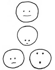
 These basic cartoon strategies can be most easily seen with simple demonstrations.
In this figure the human face has been "leveled" to a circular shape, two eye dots, and a mouth line. The enormous complexities of the human physiognomy have been reduced to their bare essentials, but they are not distorted.
In the next step, the cartoonist "sharpens" and "assimilates" through the placement of facial features. Exaggerating these elements creates the look of youth, or sadness or bewilderment.
The cartoonist can begin to create these impressions even before adding the more obvious smiles or frowns, ears or noses, hair-do or costume. And these simplified exaggerated faces tend to be "funny". They are recognizable, yet they are unusual.
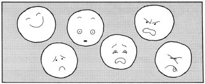
Telegraphing Emotion
Research identifies half a dozen universally recognized facial expressions of emotion: happiness, sadness, anger, surprise, fear, and disgust. Some of these expressions are perceptually complex. But the cartoonist uses artistic shorthand, which levels, sharpens and exaggerates the difficult cues.
An obvious example is happy-ness which is communicated with the up-turned mouth. The crescent-shaped eyes emerge as the cheeks ball up in mirth. For surprise, the eyebrows go up, the eyes open wide, and the mouth drops open. And so on.
The Cartoon Figure
The normal human figure is about seven or eight heads tall. The cartoon figure, however, usually deviates from those normal proportions.
In fashion illustration or sports cartooning, the emphasis is on the body; the figure may be drawn ten heads tall. The traditionally sexy "pin-up" is likely to have abnormally long legs.
In the humorous cartoon, the head is usually very large in many the proportion to the body. In cartoon characters (Snoopy, Ziggy), the head is as big as body. The larger-than-normal head produces at least two effects. One, it makes the cartoon figure seem cute and childlike. Two the exaggerated head size gives play to the facial features and expressions which best communicate personality and feelings.
3-D and Action
To create a three-dimensional, make-believe world, the cartoonist provides us with a number of perceptual cues that we use daily in navigating through the real world:
- size - distant items are smaller
- overlap - near objects overlap more distant ones
- clarity - closer objects appear sharper (usually drawn with a heavier line)
- detail - nearby characters have texture and facial features while distant ones are barely outlined
- color - brightly colored items (red, for example) will advance while cool, blue objects will recede.

The cartoonist adds "action lines" to indicate the direction and speed of movement. Straight lines are fast, wavy lines are slower. When something travels fast, it may "disappear in a cloud of dust." The cartoonist picks up this metaphor literally.
Thought and Language
The stars of cartoon symbolism, of course, are the thought balloon and the speech balloon. Objects and animals which look like humans are anthropomorphic. If they act like humans, the anthropomorphism increases. And if they think and speak like humans, the anthropomorphism is complete; they really seem to come alive.
The importance of intertwining speech and action has been emphasized by those who see the comics as a distinct art form. Cartoonists themselves comment on the unique sense of creation they get from combining word and action.
Summary
These they are the tricks of the technical trade," the coding the cartoonist a make- believe world, to create figures, to give them depth, to give them action, thought and language. The techniques themselves are not difficult, but to create a make-believe world which an audience will want to visit again and again - that is a challenge.
*****
Copyright 1981, Sage Publications. Posted with permission.


